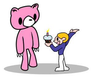
Yesterday was Shirley‘s birthday. We went out for dinner with a bunch of people and drank. It was fun. I also decided to play with my tablet, yesterday. So a birthday ecard was a natural gift!! I sent this to her a day late.

Similar to my A Bug’s Life post, I’ll give a little overview of the process that went into this picture… I do this because I tend to enjoy reading these types of posts, myself… and… I can’t be the only one! 🙂
First, the idea: I know Shirley likes Gloomy Bear… but I know almost nothing about it! After a little searching to get the idea of Gloomy Bear’s looks. I gave it a first attempt:

I watched an informative and entertaining 3-minute video.Usually with Gloomy is the boy, Pity. Pity loves Gloomy, even though Gloomy’s a bear and attacks Pity, sometimes. I wanted the boy giving Gloomy a cake… then Gloomy reacting. Let’s try for more action….

Well, I was content with the idea… but that still didn’t look like Gloomy, at all! Did a couple sketches of Gloomy and Pity for a little practice:


Alright, these were looking a bit better. The perspective I wanted was a little awkward, but I’d give it a shot. The following resulted from drawing a lot and erasing a lot on the same sketch. That’s why it looks “smudgy.”

Awesome. It was starting to look acceptable. Now I had to make a nice outline. Using the Pen tool in Gimp, I added a new layer above the blue sketches. On this layer, I created paths and then applied strokes to the paths. (This kind of art should really be done with a vector program, like Inkscape, but I was tinkering in Gimp.) When I was done, I had a clean outline sitting on a layer above the blue sketch:

Next step was adding colour. This was really easy because the style for Gloomy Bear doesn’t have any shading – a single solid colour is applied to everything. Alright, then! Just had to hide the messy blue layer and add colours to a couple layers beneath the outline layer (we want the outline to be on top).

Add some text, a few touch-ups here and there, and that’s basically it! 🙂 Yay!
Originally, I did have a more elaborate idea of doing a stylish multi-panel comic:
- Pity gives Gloomy a cupcake.
- Close-up of cupcake.
- Close-up of Gloomy’s face, colours inverted.
- Gloomy reacts violently.
- Back to original scene, with after-effects.
This was my sketch for the reacting violently panel: 😉

Would have been fun. But I decided to keep things simple. 🙂
All images are under the Creative Commons Attribution-NonCommercial-ShareAlike 3.0 License. And I would appreciate being told if you use anything. 🙂
Wow, nice!! And I almost wish you had stuck with the original idea with a tiger uppercut ending!
I never knew the history of Gloomy… Hm… It certainly is fitting as Shyaaariii-sama’s alter ego…
I am the luckiest girl.
I have a friend who has his pressure sensitive tablet working on Linux, and received a present that’s under the CC Non-commercial Sharealike license.
What else can I ask for. Really. Thanks, Steve!
I am going to repost this on my blog.
LOL. Well, you’re free to do whatever you want with yours, Shirley. It’s yours. It’s a bit higher quality, too. 😉
…and Gloomy looks really cute in the interview video.
i have an original gloomy (with blood) black bear. Had a pink one but it’s gone 🙁
got em off ebay …8 years ago? wow holy crap
gostei adoro